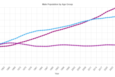
So, I’m pretty interested in the state of the world and how populations in wealthier countries are starting to fall. I was kind of looking…
So, I’m pretty interested in the state of the world and how populations in wealthier countries are starting to fall. I was kind of looking…